
F23

When I first started Mixed, my design “process” was pretty much nonexistent. It was more like throwing a bunch of stuff at the wall to see what would stick. Now, with more time, experience and bandwidth, I’ve been able to refine my design process and approach it with more thought. The creative process is all about iteration—our first go at things will never be our best, but we can’t allow that to stop us from sharing our work with the world. We have to start somewhere, and with each iteration, we can distill, improve, refine. With 6 collections under my belt, I’m so excited to share a behind the scenes look at the F23 design process:
Inspiration
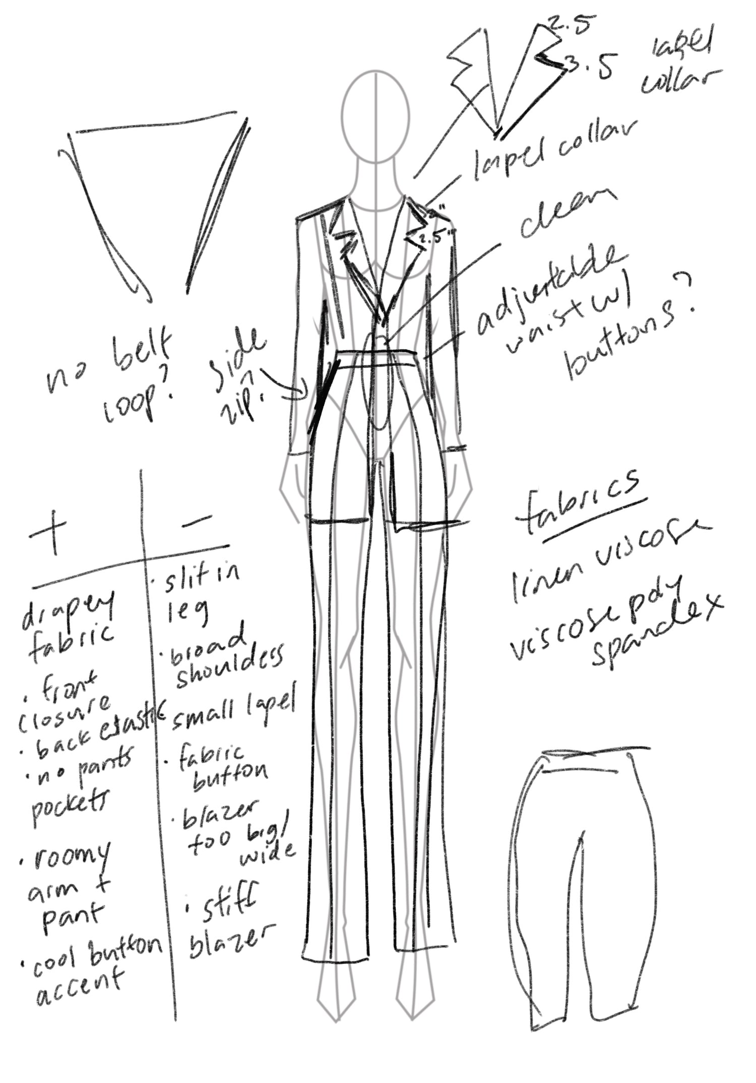
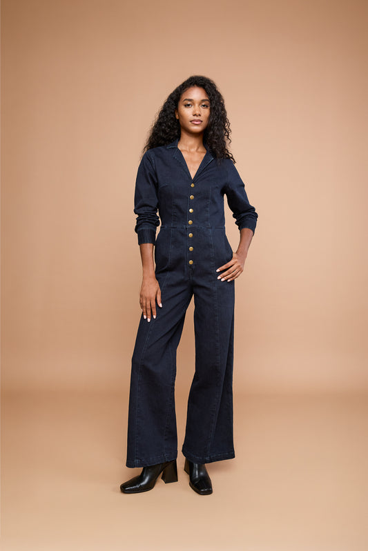
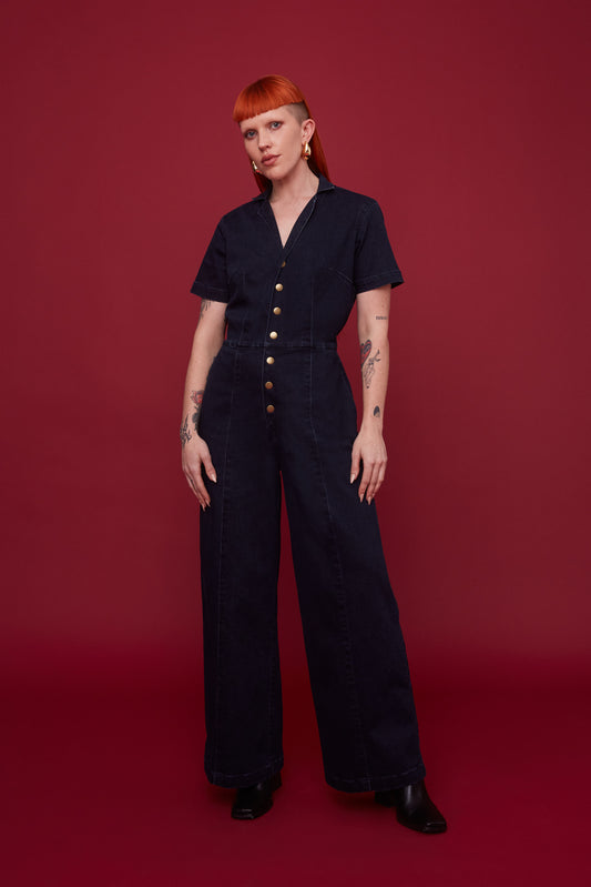
The F23 design process started with studying a variety of different suits, taking note of how various design elements contributed to the style of each garment. I wanted to design a suit that could be dressed up with a heel or down with a sneaker, worn as a set, or as separates. If you know Mixed, you know we love versatility. I started sketching silhouettes in more detail, adding notes to the margins of the page, and keeping in mind the practical constraints that the material would impose on the silhouette. I designed a clean silhouette with minimal trims that would allow the print to shine.
shop F23
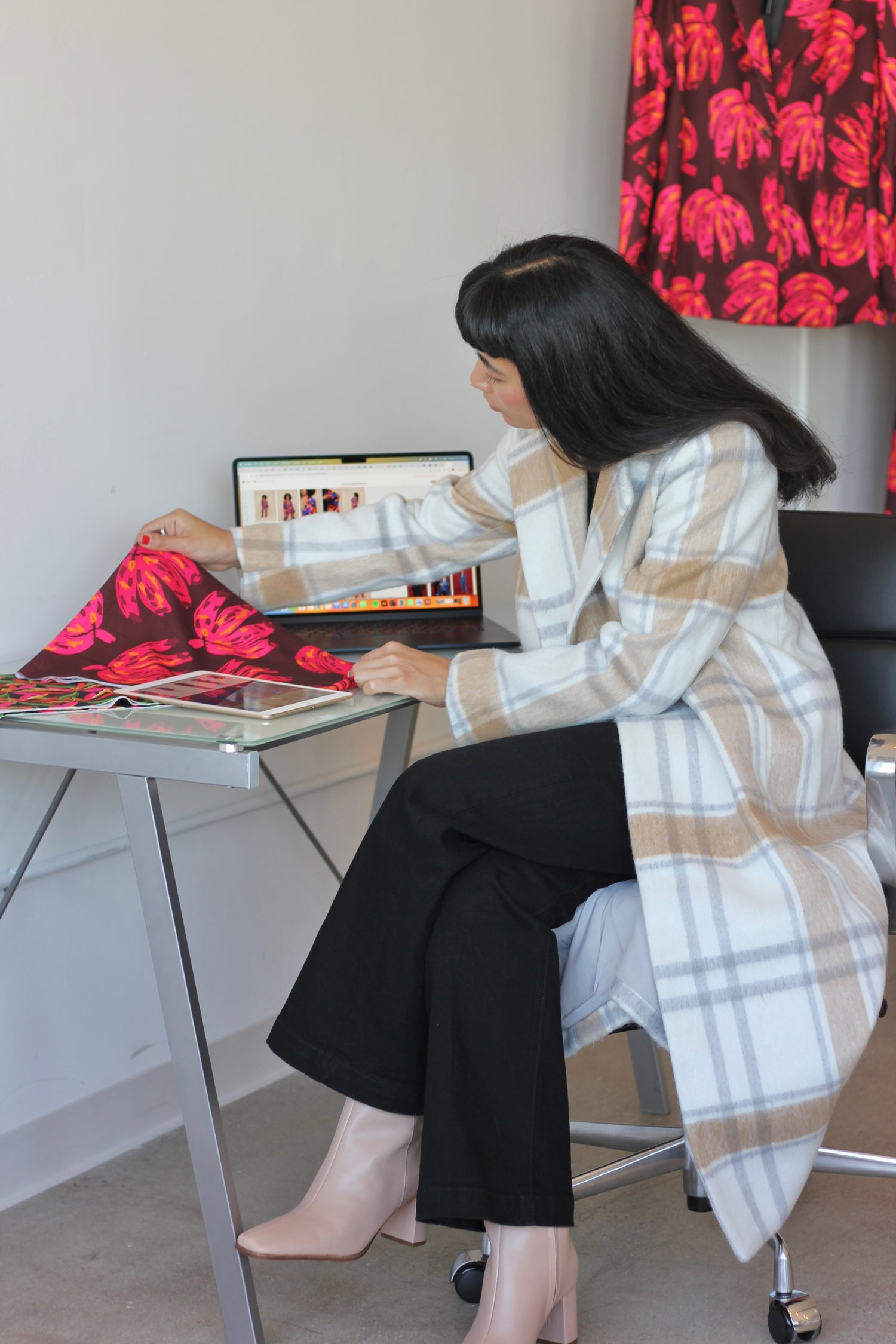
Designing the prints for each collection is where I find my flow. I started by creating a color story, inspired by hues of the season—burnt orange, berry red, match green and cool blue. With a color palette to keep the collection cohesive, I like to let my hand start drawing freely, improvising strokes until an interesting shape or motif appears. Once I’ve landed on a motif, I play around with ways to make it more abstract with color, brush strokes, or scale. Once I’m onto something with a print, I know it—I feel it. I just keep my head down and draw as time melts away around me. F23 features 6 brand new prints in bold, fall colorways:
Concrete Jungle
Concrete Jungle embodies what I love most about fall in NYC—watching the leaves turn all shades of yellow, red, and orange. The crisp air and brilliant colors that take over the city remind me that, no matter what season I find myself in personally, everything will continue to flow. This repeat print emphasizes that awe-invoking feeling of seeing thousands of leaves changing color at once.
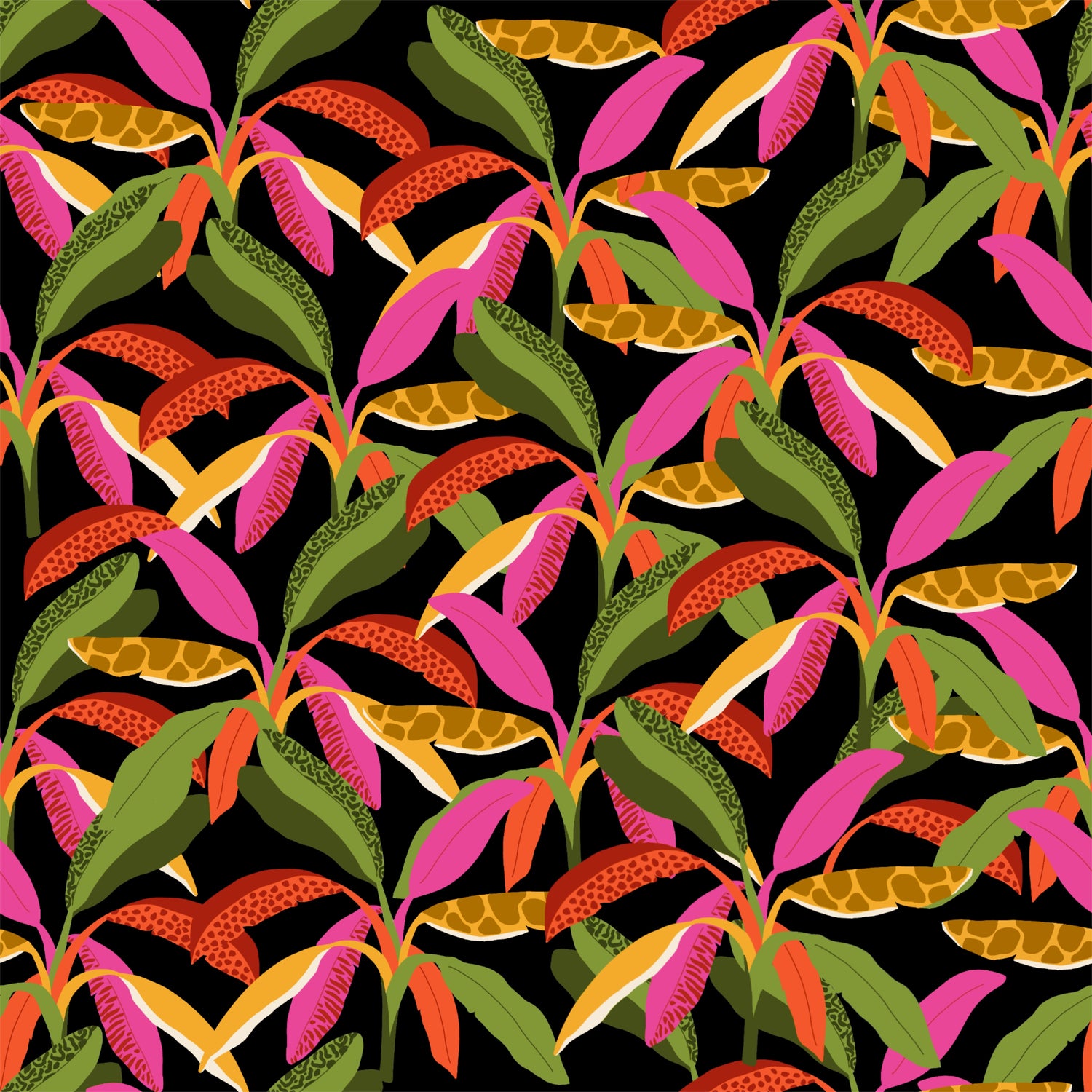
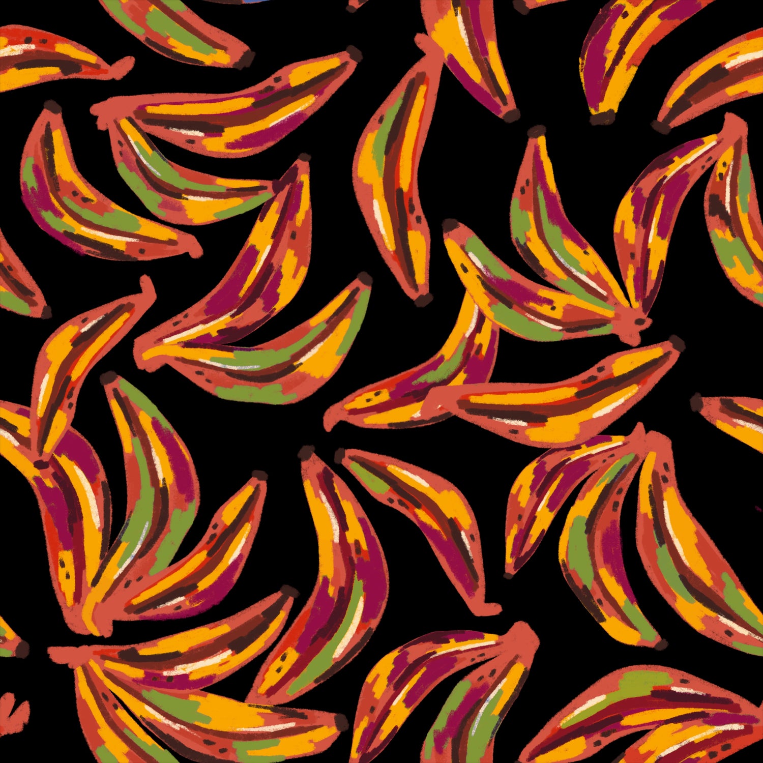
Passion Plantain
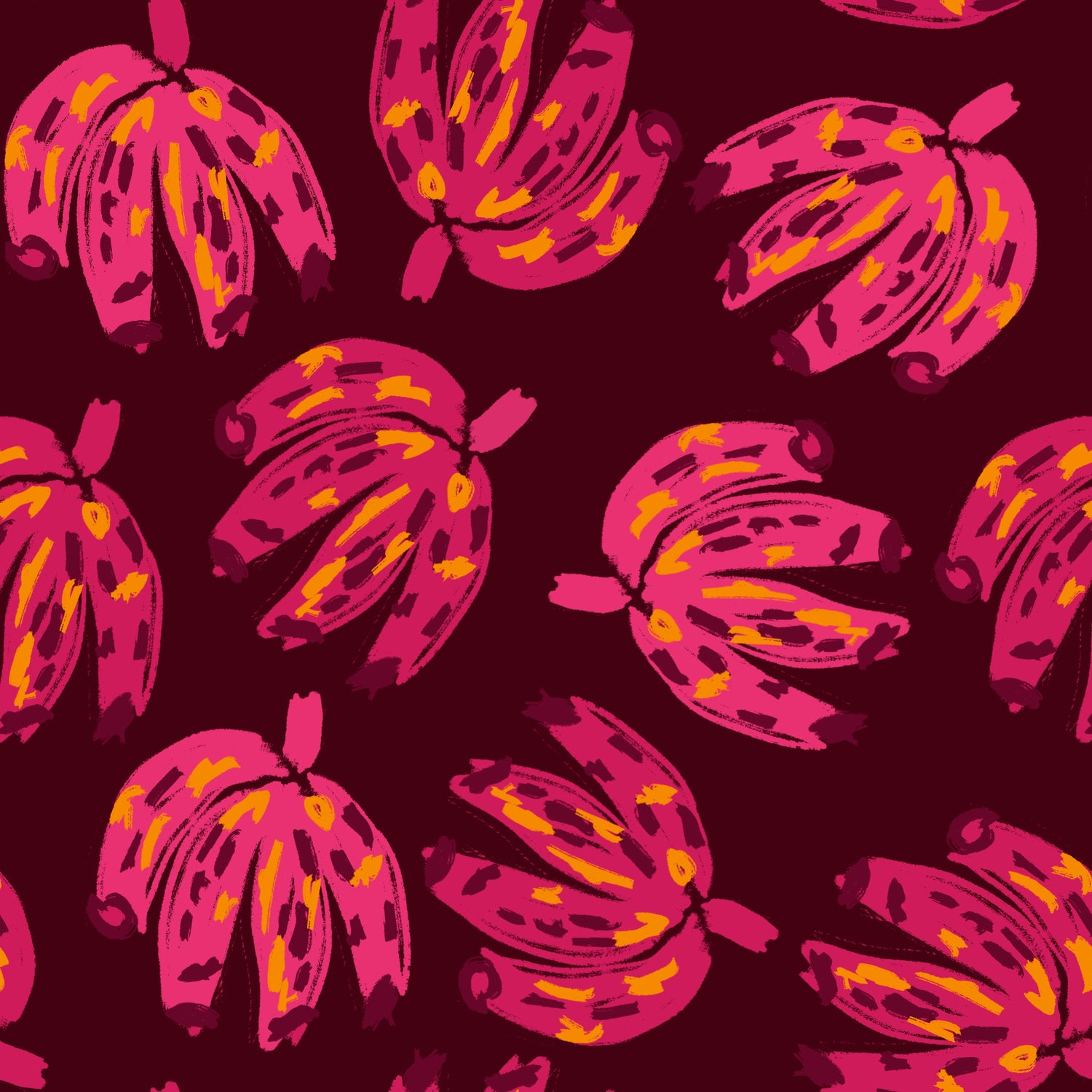
Passion Plantain was one of those prints that flowed right out of me—I didn't overthink the design. Sometimes when patterns come to me so effortlessly, I question if they’re finished, but I’m learning not to second guess myself. The quick, fast, and abstract strokes, combined with the deep burgundy ground and bright pink plantains, make this print fun, wild, and bold.
Hazy Daisy
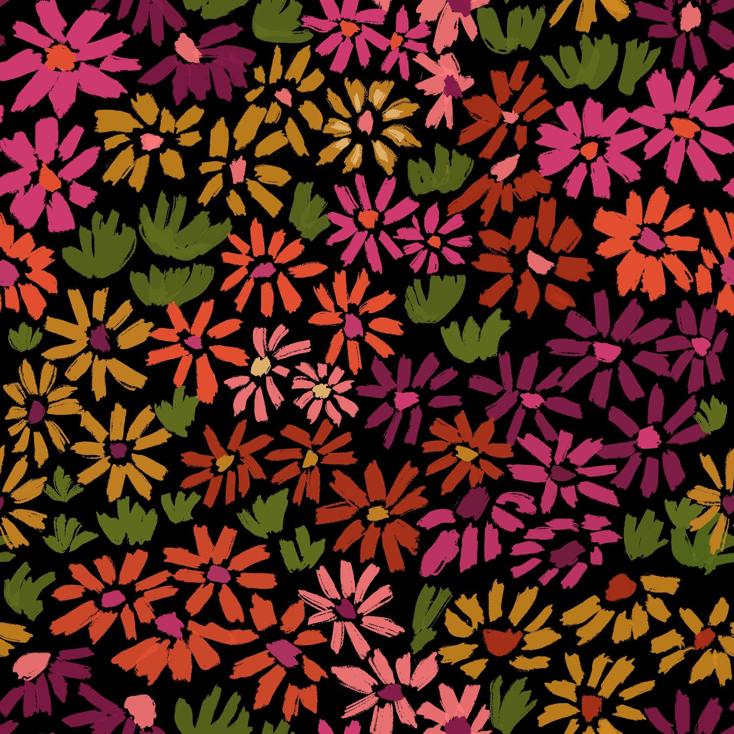
Hazy Daisy is the ultimate fall floral print, complete with every shade of the season you could ask for. To set this floral print apart, I designed the flowers with more geometric strokes—you’ll notice that there aren’t any rounds or curves in the petals. I wanted the flowers to feel bold and take on an almost abstract pattern when observed as a whole.
Trailblazer
Hazy Daisy is the ultimate fall floral print, complete with every shade of the season you could ask for. To set this floral print apart, I designed the flowers with more geometric strokes—you’ll notice that there aren’t any rounds or curves in the petals. I wanted the flowers to feel bold and take on an almost abstract pattern when observed as a whole.
Moxie
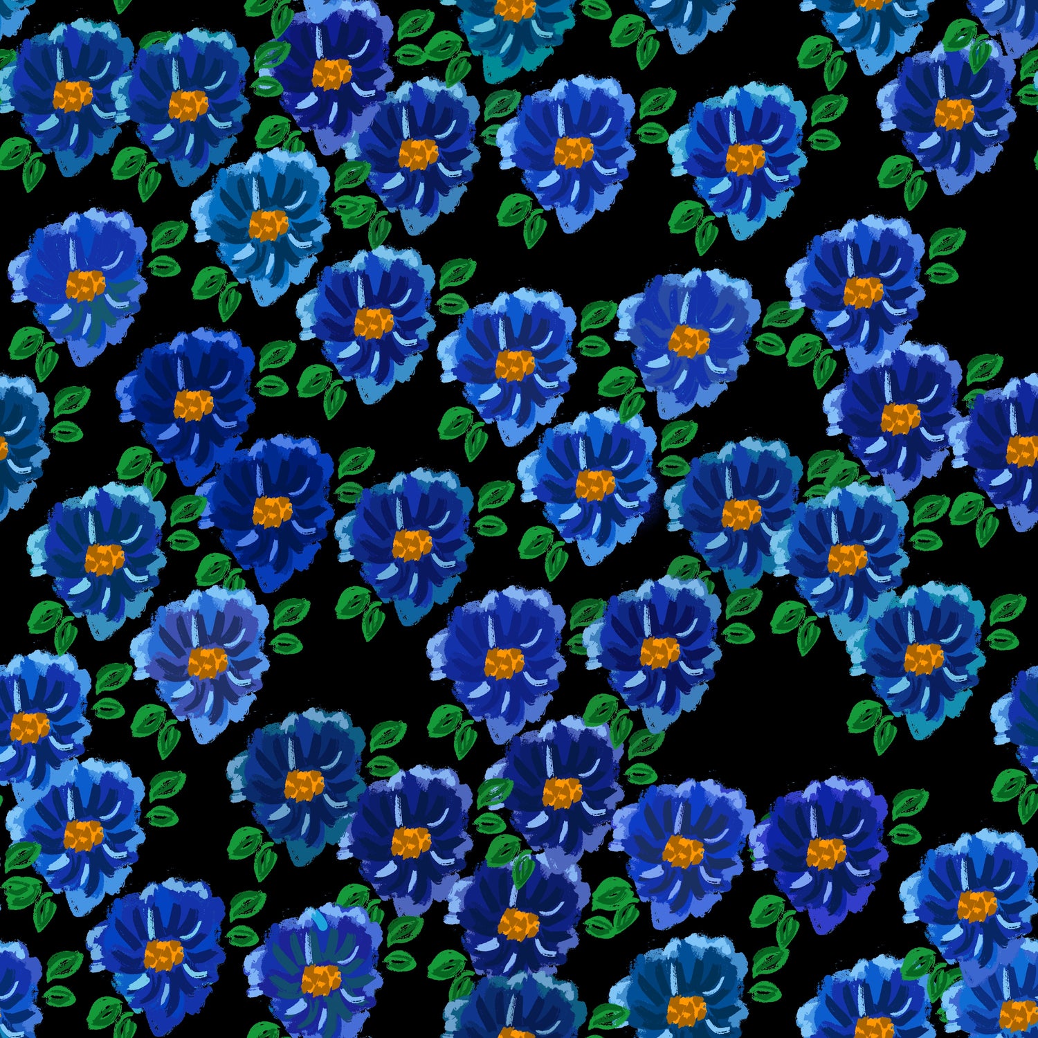
Moxie was a fun print to design—inspired by swanky hotel wallpaper, it features a series of double-petaled flowers in different shades of blue, arranged in a tight, grid-light pattern. As soon as I was finished with the design, something about it screamed velvet. Moxie means “a force of character, determination, or nerve” which is exactly what a velvet suit in this pattern embodies.
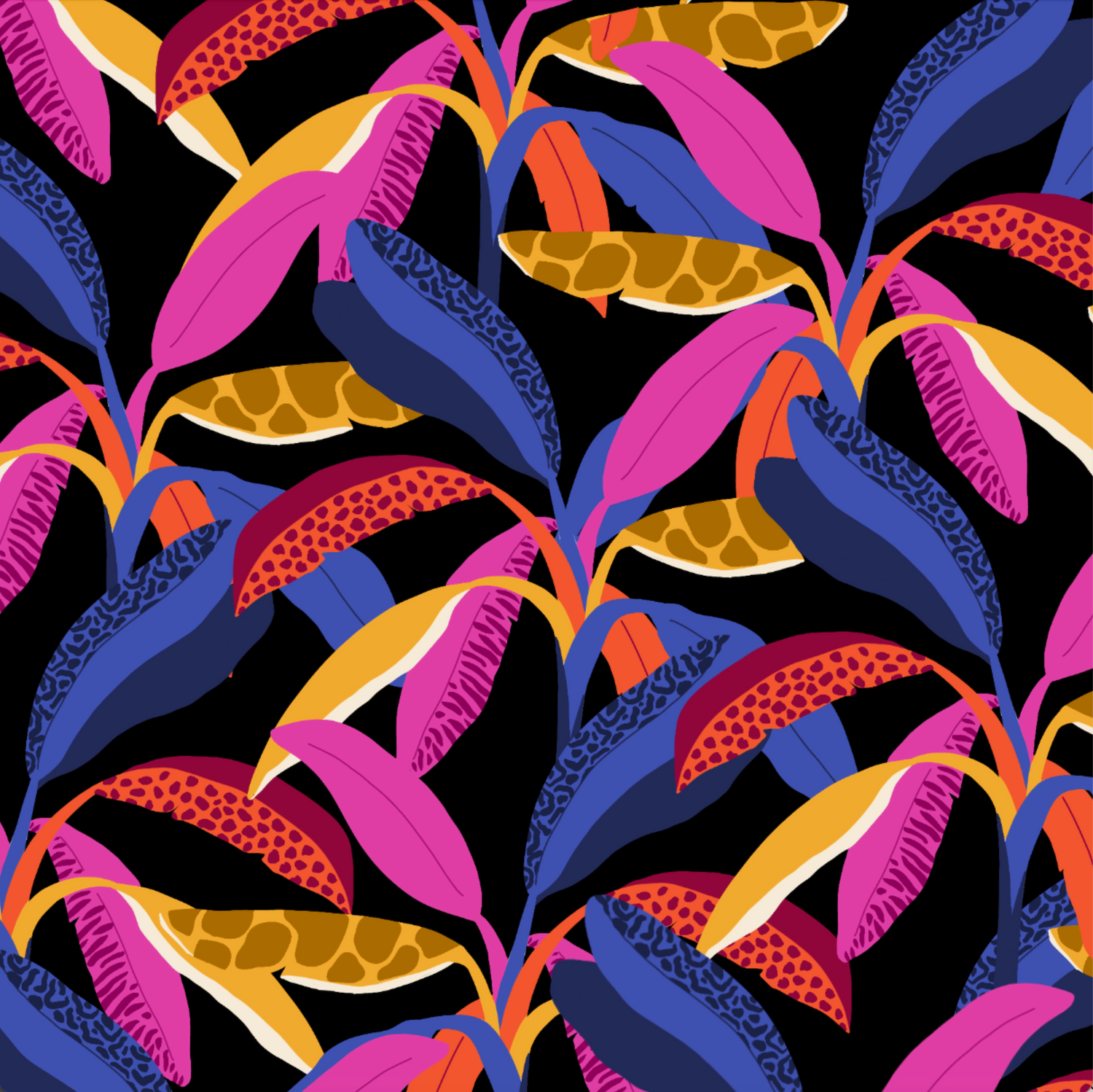
Plantain Party
Plantain Party was an experiment in combining natural forms with abstract color strokes to create a striking pattern. I sampled colors from different varieties of plantains in various stages—the unripe green skin, to the ripe yellow skin and the rich brown and burgundy of red plantains. I combined these color strokes together to symbolize the different stages of growth we can experience at the same time—a reminder to embrace our multitudes with color.
Development
With the sketches and vision complete, I traveled to our factory and worked with our production team to develop the first sample, detailing what the garment should look and feel like and how it should fit and drape.
Receiving the first sample is probably my favorite part in the design process—it’s that first moment I get to see my initial vision come to life. The first sample of our suits included tapering at the waist of the blazer, which gave it a dated look that I hated. Bye-bye taper! Then the length of the blazer was also too short, which gave it a business-casual feel that I wasn’t looking for, so I added an inch and a half of length to the blazer to give it a more relaxed style. During one of these sessions, Kassandra suggested inner pockets instead of outer pockets for added function and elevation. Then Jasmin pointed to one of the prints and thought it would look good in velvet—my thoughts exactly. After a couple more iterations, we created the final sample that checked all the boxes and the suits went into limited quantity production!


